Elevate Your Interior Design: Exploring the Latest Trends in Color Schemes
Color is a powerful tool that can transform a space from ordinary to extraordinary. This year, waves of color trends have emerged, bringing fresh and inspiring palettes that captivate both homeowners and design enthusiasts. From bold and daring combinations to calming and soothing hues, these color schemes offer a plethora of options to suit various styles and preferences. Let’s explore some of the hottest color schemes that are making waves in 2023, along with the best rooms to incorporate them in, and how to use them effectively through wall colors, wallpaper, accent walls, moulding, and even doors.
Expertly Chosen
Every year, experts like Benjamin Moore and Pantone around the world choose the color of the year. The color of the year is meticulously chosen by studying color trends throughout the years and taking into consideration all aspects of society including current trends, social media, politics, and fashion. Pantone chose Viva Magenta for their chosen color and Benjamin Moore’s is Raspberry Blush. Colors have the power to evoke emotions. Raspberry blush, with its soft pink hue and warm undertones, often elicits feelings of happiness and romance in those who encounter it. Its bright and cheerful appearance has the power to uplift spirits and infuse a sense of joy into the atmosphere, making it a popular choice for decorations during festive occasions and celebrations. Viva Magenta’s vibrancy can create a sense of excitement and adventure in a room. It’s a color that can make people feel alive and passionate about their surroundings. When a color like Viva Magenta is chosen as the Color of the Year by a prominent color authority or brand, it often sets a trend in the interior design world. Designers and homeowners alike may incorporate variations of this color into their projects, leading to a surge in availability of home décor items and furnishings in similar shades.
“It’s a really charismatic color and doesn’t sit quietly on the wall,” says Andrea Magno, color marketing and development director at Benjamin Moore. “It’s about awakening our senses and getting people to engage with a vivacious color.”
We couldn’t agree more; last year’s colors were more vibrant, but this year, we’re seeing shades that draw from a deeper and earthier palette, offering a new twist on the colors we know and love. Think of a Mediterranean color palette—still vibrant, but with tones that complement nature like warm browns and whites. There’s a suitable place for each of these color schemes, catering to a variety of style preferences.
Made for Luxury
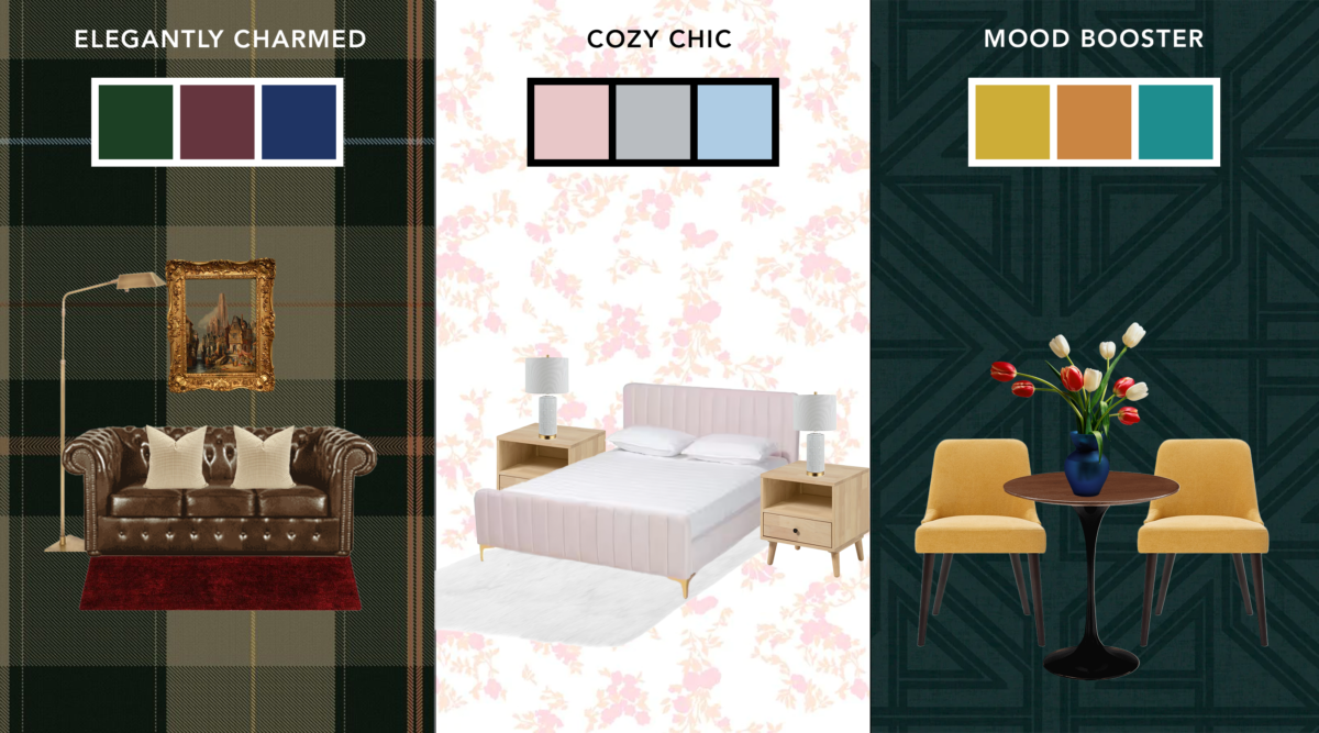
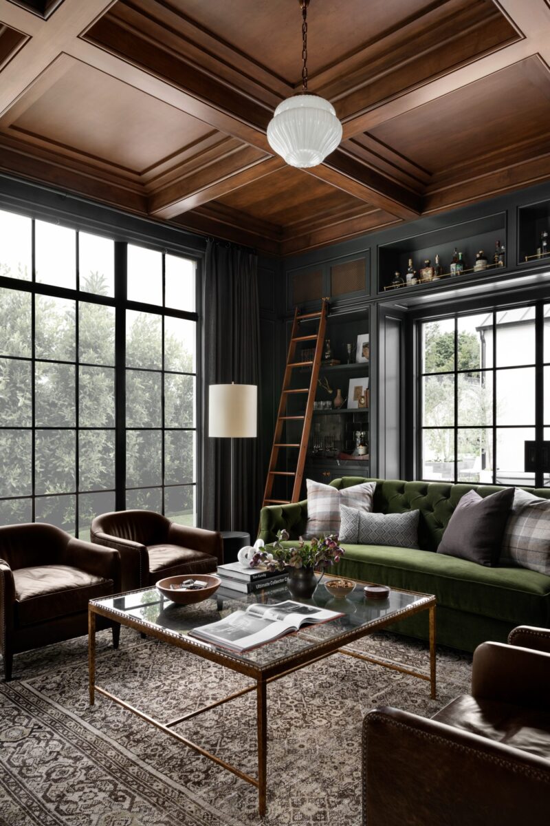
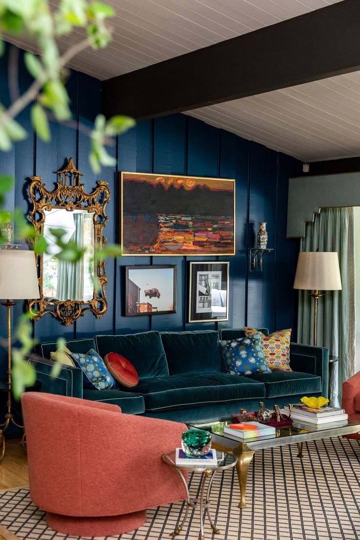
Elegantly Charmed draws inspiration from classic elegance. Incorporate rich, jewel-toned hues like emerald-green, ruby red, and sapphire blue. This color scheme exudes sophistication and boasts intellect. Reinvented Heritage embraces a mix of traditional and contemporary elements, where these colors are often seen. In this style, you’ll often see deep colors paired with mahogany wood. These colors work exceptionally well in living rooms and dining areas where you want to create a refined and inviting atmosphere. Invest in furniture pieces that incorporate the chosen colors. Add a mustard yellow throw pillow doused in gingham patterns to a velvet burgundy tufted chair. Mixing and matching furniture in these jewel tones can create a visually interesting and cohesive look. Another way to add a touch of classic elegance and warmth to your space is to add stained moulding! Replace your old moulding with stained crown moulding with a build-up to add even more depth to your home. Stained molding is often associated with historical and traditional design styles. Adding it to a space can evoke a sense of classic charm and timeless beauty, making it feel inviting and comforting. Finishes like mahogany or antique cherry can evoke a sense of classic charm. For an “Elegantly Charmed” living room, a plush sofa with armchairs upholstered in delicate fabrics such as silk or velvet in matching jewel-toned hues. Further enhance the ambiance with metallic accents in gold or brass can be found in detail like picture frames, mirrors, and coffee table décor. Richly patterned area rugs in complementary colors anchor the seating area and provide a touch of visual interest. Using rich jewel-toned colors, wood, and stained molding can make your space feel elegantly classic and timeless, leaving you and your guests charmed and inspired.
Cozy Feels
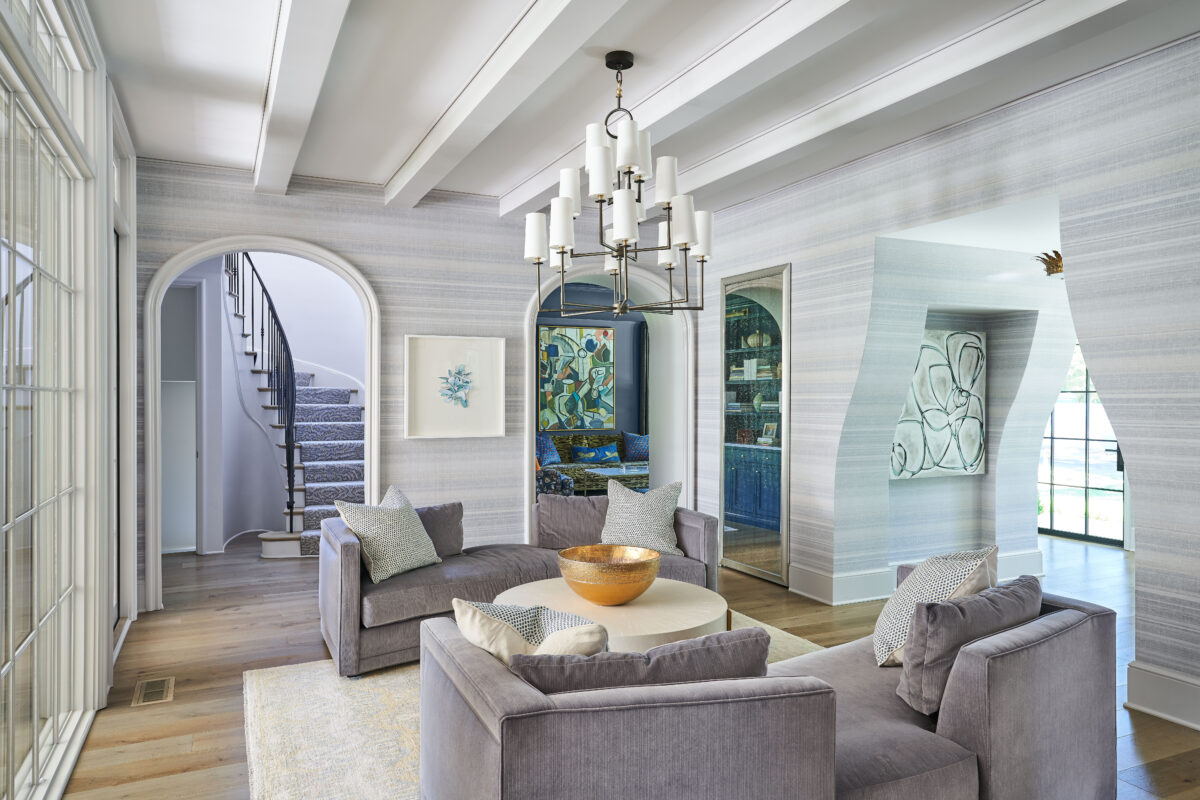
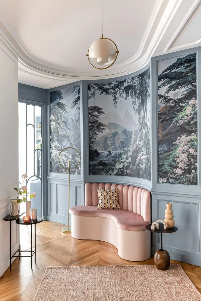
The Cozy Feels color palette embraces feminine simplicity by pairing muted colors with warm neutrals. Colors like soft blush pinks, cool grays, and pale blues are excellent for this palette. This scheme is ideal for spaces where you want a serene and calming ambiance, such as bedrooms and home offices. Create this balance of beauty and calm to your space with Swedish Country interior design! Adding these colors to your wall is an easy and fun way to add character. Choose wallpaper with subtle and delicate patterns that complement the softness of the “Cozy Feels” palette. Designs with delicate florals, simple stripes, or gentle geometric patterns in muted shades bring out a feminine feel. Textured riomar walls create a woven or fabric-like appearance to your interior space, giving it a visually captivating dimension that transforms the entire room. This adds variety to the walls while staying true to the cozy and serene theme. Pair them with bedroom furniture in cool wood tones, such as light walnut. A wooden bed frame, nightstands, and dressers with simple, rustic designs align well with Swedish Country style, creating a restful and comfortable haven. For a home office, hang calming wall art, such as landscapes, botanical prints, or serene abstract paintings in soft pastels, to create a tranquil atmosphere conducive to work. Incorporate pendant lights or desk lamps with brass or copper finishes for a touch of elegance. Light calming colors help improve productivity by reducing stress, enhancing concentration, and promoting a tranquil, focused work environment. By thoughtfully integrating these elements into your bedroom or home office, you can achieve the “Cozy Feels” color palette while embracing the soothing and chic qualities of Swedish Country interior design.
A Dynamic Look
Mood Booster is all about dynamism and energy. With vibrant pops of color against a backdrop of neutral tones, this scheme is perfect for spaces that need a lively boost. The Boho-Chic interior design style is the way to go with this exciting color palette. Its bright colors, yet muted chicness provide a fool-proof plan to add these energetic colors to your home. The entryway sets the tone for your entire home, making it an ideal space to infuse vibrancy and excitement. Start by selecting a bold and an attention-grabbing color for your front door, such as electric yellow or fiery orange. This choice immediately creates a cheerful and inviting atmosphere for anyone who steps inside. To carry the theme, designate a functional geometric accent wall painted in bold hue to establish a visual focal point. Further into the space, place colorful accessories like a decorative vase, a vibrant rug, or even a striking pendant light with colorful shades. These elements not only add color but also contribute practicality and character to this space. Kitchens, often referred as the heart of the home, are ideal for implementing the “Mood Booster” color scheme to enhance their inviting nature. Upgrade the ambiance of your kitchen, with a lively patterned backsplash, like retro geometrics and whimsical motifs, which allows you to express your unique style and creativity in the kitchen. Elevate the dining experience by introducing macramé table linens or vibrant cutlery that make mealtimes more enjoyable. This dynamic color palette, coupled with the Boho-Chic style, brings fresh and exciting energy to your living spaces, making your home an inviting oasis filled with personality and vitality.
Regardless of your color scheme, these are key ways to implement your scheme into your home:
- Decorative Accessories: Use colorful decorative items such as throw pillows, blankets, vases, and sculptures to introduce vibrant hues into your space. These items can be easily switched out or rotated to refresh the color scheme.
- Area Rugs and Carpets: Incorporate colorful area rugs or carpets that align with the desired color scheme. A bold rug can become a focal point in the room and tie together various design elements.
- Curtains and Drapes: Choose curtains or drapes in vibrant colors that complement the room’s existing color palette. These window treatments can add a splash of color while also enhancing the overall decor.
- Plants and Flowers: Indoor plants and flowers not only bring a touch of nature but also contribute vibrant colors. Choose colorful planters and vases to enhance the visual impact.
- Functional Accessories: Utilize colorful functional items such as vibrant kitchen appliances, colorful dishware, or decorative storage boxes. These items serve a practical purpose while adding color to the room.
- Lighting Fixtures: Consider colorful lampshades, pendant lights, or chandeliers to introduce color through lighting. The right lighting can create ambiance and emphasize the desired color palette.
- Textured Elements: Incorporate textured elements in your chosen colors, such as textured wall panels, upholstered headboards, or woven baskets. Texture can enhance the visual appeal of the color scheme.
- Cushions and Seat Covers: Place colorful cushions or seat covers on chairs and sofas to introduce color to seating areas. This is an easy way to add pops of color to existing furniture.
- Books and Decorative Objects: Arrange books, decorative objects, and trinkets in your chosen color palette on shelves and surfaces. These accents can contribute to a cohesive color scheme.
Remember, the key to successfully adding color without paint or wallpaper is to choose items that align with your overall design, vision, and color preferences. By combining a variety of these methods, you can transform your rooms into vibrant and visually appealing spaces. In conclusion, the power of color is undeniable when it comes to interior design. The color schemes of 2023 offer a range of possibilities, from elegant and sophisticated to lively and dynamic. Whether you choose to integrate these colors through wall paint, wallpaper, accent walls, or decor items, you have the tools to transform your space into a captivating and personalized haven.
Check out our Pinterest Board for more inspirational designs and make sure to follow us on all of our social media platforms @WeAreWoodgrain