Viva Magenta: The 2023 Pantone Color of the Year
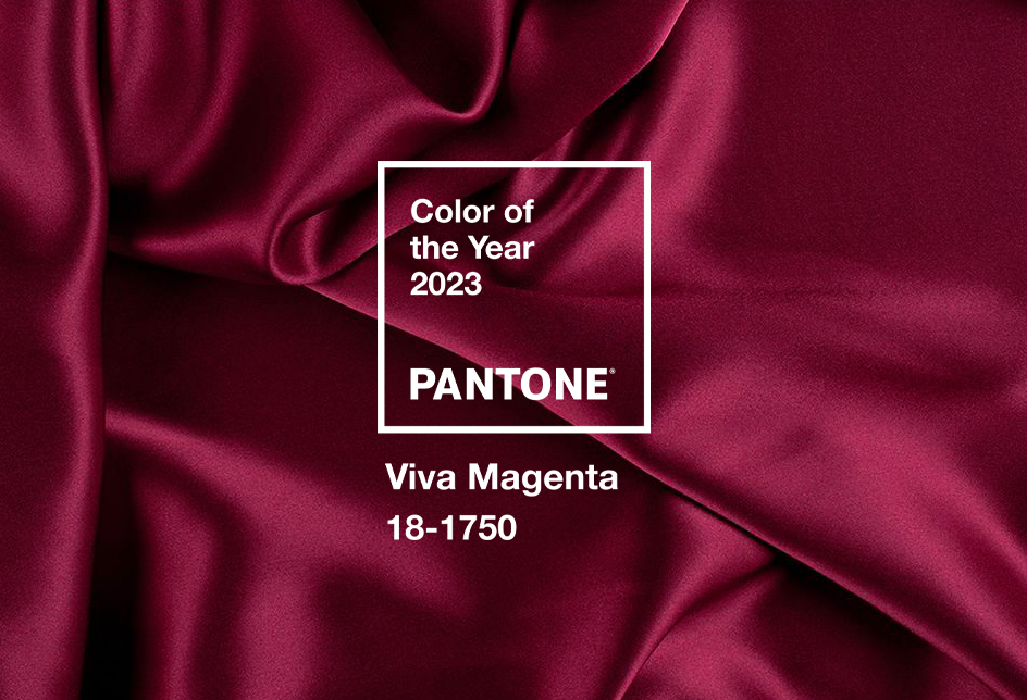
We saw bold, bright colors all throughout 2022. Homes engulfed in green and blue hues. This year we’re expecting bolder, brighter colors. Pantone Color of the Year was announced as Viva Magenta 18-1750, a stand-out statement color descending from the red family. Like previous years, this color is rooted in nature. In fact, inspiration came from the cochineal beetle’s dye. A cochineal beetle produces carmine dye, one of the most precious, strongest, and brightest natural dyes. Pantone wanted this color to represent a new narrative, while empowering us to be fearless in self-expression.
Let’s discuss how you should incorporate this color into your home.
Color Palette
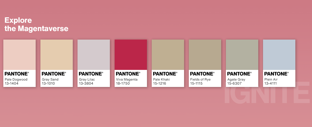
You’re probably wondering how to add a bold and vibrant color to your home. Well, Pantone released a color palette that compliments magenta. It’s light, airy, and neutral. It’s advised to use a dominant color for roughly 60% of your room, secondary color for 30%, and accent colors for the remaining 10%. You want your space to feel cohesive with furniture, fabrics, accessories, and paint.
While Pantone’s color of the year will sway many opinions and trends, it’s not the only color that companies are predicting to rule 2023. Dulux chose Wild Wonder, a soft and light yellow. Dunn-Edwards chose Terra Rosa, a warm brownish red. PPG chose Vining Ivy, a subtle transition between neutral-ish greens and blues. Behr chose Blank Canvas, a neutral monochrome hue to represent a starting point of a forked path. Sherwin-Williams chose Redend Point, a dusty blush beige with a desert-like feel. Benjamin Moore chose Raspberry Blush, an unapologetically bold color radiating red and orange coral notes. Graham & Brown chose Alizarin, a rich, stirring auburn hue. And lastly, York Wallcoverings chose Amber, a luscious honey color.
These colors aren’t synchronizing and clash aesthetically if put together all at once, so just remember your home’s defining color can be whatever you choose; these are just predictions.
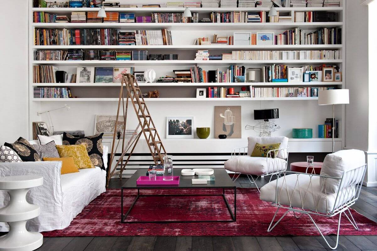
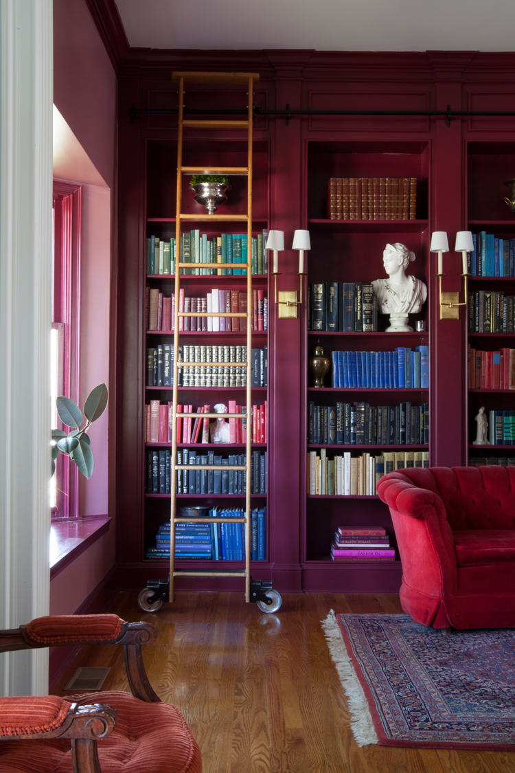
Furniture + Décor
Choosing furniture and décor is the highlight of designing any space; “the cherry on top” so to speak. You want to keep your color palette in mind when choosing your furniture and décor. If you stick to a chosen palette, mixing and matching will feel more seamless, especially with a bold color like Viva Magenta. When we think of stand-out colors, we often imagine a Maximalist or Art Deco style. Both interior styles heavily involve bold color choices and whimsical décor. There are two options: create a focal point or add accent pieces.
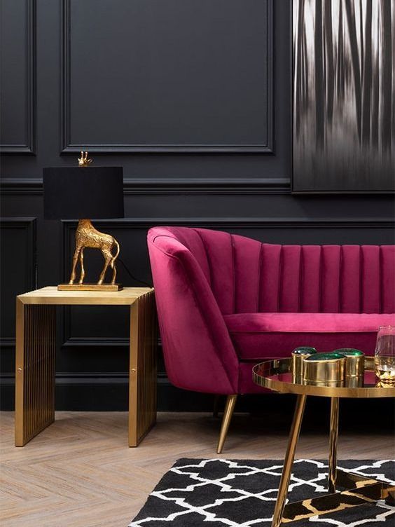
You can add a focal point through large paintings or placing a contrasting-colored couch in your living room. Depending on your budget, add a Viva Magenta velvet couch or choose accent chairs to better compliment your style. Play with textures like leather, velvet, and silk to create a tasteful design. If a couch or accent chair feels too grandeur, you can create a focal point with large paintings. Great Big Canvas offers a wide selection of artwork to showcase throughout your home that boasts magenta and similar colors.
There’s more flexibility in using accent pieces. Think of a colorful vase, pillows or blankets, rugs, and even curtains. We’d advise starting with smaller accents and expanding as you feel comfortable. “Accents” are just that: accents. They’re meant to stand out while complimenting your overall interior style. If your palette is mainly neutral, and you use Viva Magenta décor, then it will become an accent. Whether you’re adding new Ingrid Curtains by Anthropologie or tossing some new throw pillows on your couch, the possibilities are endless!
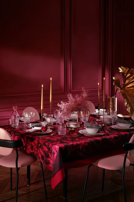
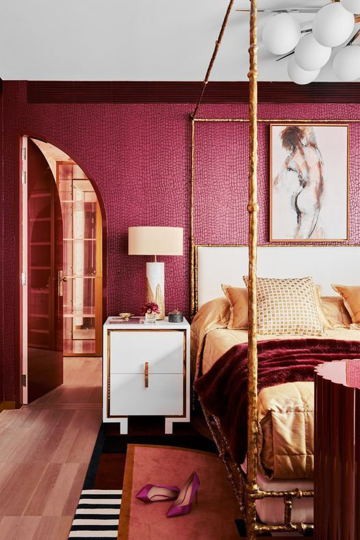
Design Ideas
If you’re looking to make a statement or create small details, you can incorporate this color through an accent wall, wallpaper, or even full color-drenching. You’ll want to be strategic when designing the mood in specific rooms.
Accent walls are an easy and creative way to add dimension to your space. There are endless possibilities when creating an accent wall such as wainscotting, judges paneling, slat walls, geometric designs, board and batten, and so many more. Creating an accent wall is entirely based on your imagination and your interior style. Woodgrain offers a large variety of moulding profiles to help you create a one-of-a-kind accent wall. Check out our moulding profiles with our moulding finder or locate a dealer near you.
For a more subtle way to introduce this color, you can add wallpaper anywhere from the walls to the ceilings. Like paint, the placement of wallpaper can drastically change the feel of a room and transform it to feel larger, smaller, etc. Since Viva Magenta is already a bold color choice, you can decide whether you want wallpaper that is just as loud or one that is subtle. Viva Magenta Regency Jumbo Wallpaper by bruxamagica is a perfect balance. Try creating a framed wallpaper accent wall for more dimension.
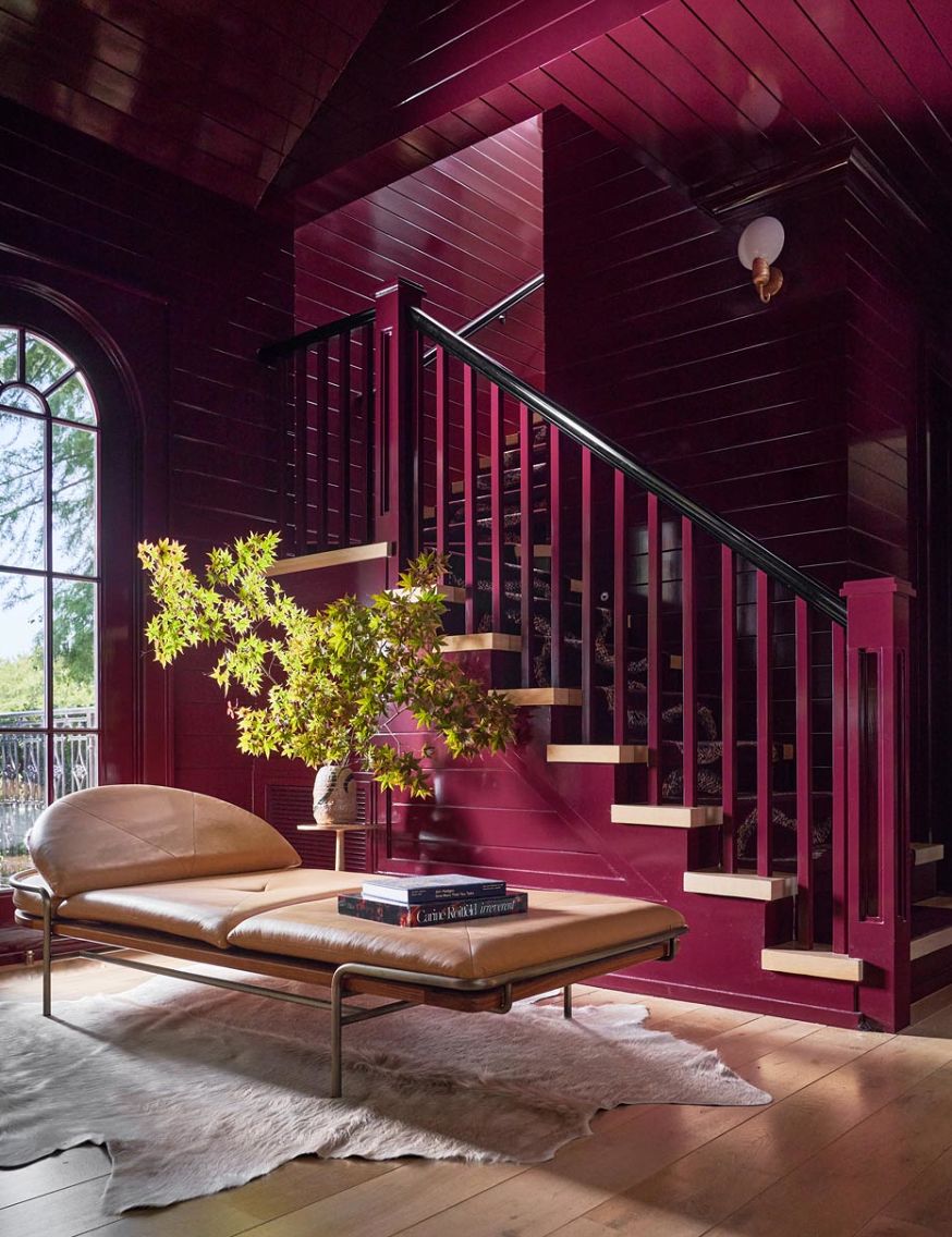
Let’s take it one step further. Color drenching involves taking one color and using different shades of it throughout a space. Think walls, furniture, and accents all being a similar shade or hue. You can even include the ceiling when color drenching, but walls are a great place to start when it comes to choosing a color.
Viva Magenta is an expressive color to get us out of our comfort zones and encourage us to be fearless. A color descending from the red family and rooted in nature has become Pantone’s color of the year and predicted to take over homes in 2023. Whether you’re fully color drenching your space or adding accents around your home, there’s so many possibilities to create the perfect balance. Stick to what feels comfortable to you, but don’t be afraid to think outside the box!
For Inspiration check out our Viva Magenta Pinterest Board and make sure to follow us on Instagram, Pinterest and Facebook ! Follow us @WeAreWoodgrain