Pantone Color Palettes for 2018
If you’re hoping to do some redecorating or need some design inspiration, these featured color palettes will NOT disappoint. Plus, they highlight or complement millwork features such as crown moulding, wainscoting and paneling.
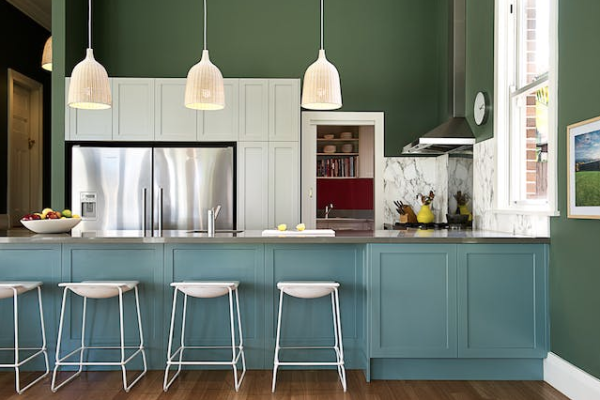
Verdure
This color palette is reminiscent of a garden and is meant to symbolize health. Verdure includes many vegetal colors like eggplant, carrot, squash, celery and greenery combined with berry-infused purples, pale blue and rich navy — like the color-blocked kitchen featured below. The dark green of the walls really accentuate the white baseboard moulding and the pale blue wainscoting below the countertop makes this kitchen feel fresh and inviting.
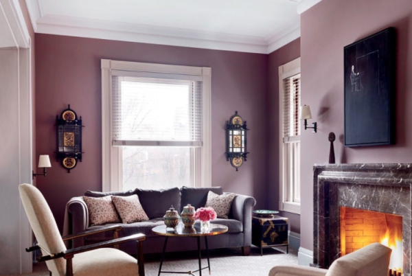
Discretion
If you like pastels, you’ll love Discretion. Featuring soft hues of Elderberry, Hawthorne Rose and Burnished Lilac, Discretion elicits a warm feeling of strength. This beautiful living room is the epitome of Discretion, boasting a pink and purple color palette with a modern twist. We especially love how the white crown and window moulding pop against the subtle purple wall
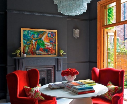
Intricacy
From rose gold to silver and bronze, the Intricacy color palette is one of sophistication, glamor and elegance. Intricacy includes a wide array of metallics — referred to as the “new neutrals” — alongside dramatic pops of colors like Holly Berry Red and Yellow Sulfur. This living room is the perfect example of Intricacy, featuring bold pops of red with a neutral metallic blue backdrop. The dark moulding on the walls and fireplace add just the right amount of drama and glimmer to make this room truly shine.
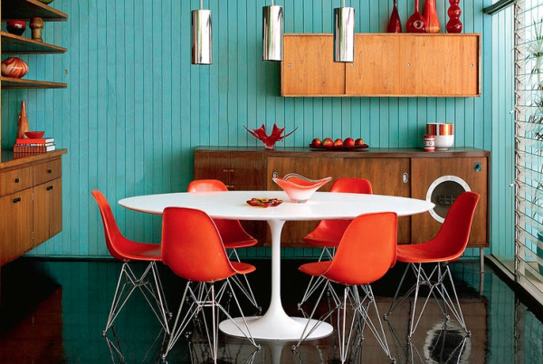
Resourceful
Bold, intense and beautiful, Resourceful is the perfect mix of warm and cool oranges and blues. This dining nook is a gorgeous example of the Resourceful color palette. It features bright teal shiplap walls alongside orange mid-century style chairs, representing a clever interplay between refurbished design and fresh new ideas.
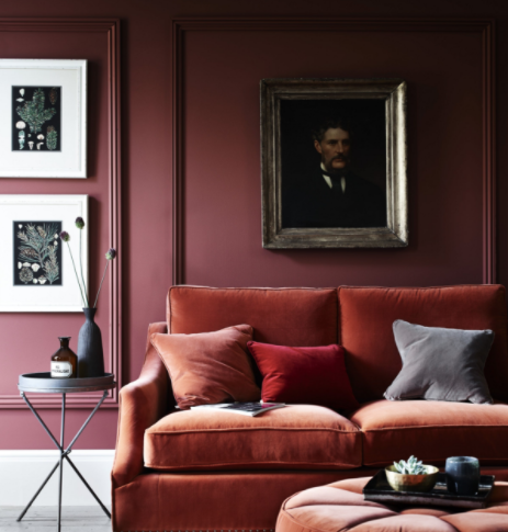
Far-Fetched
Far-Fetched is the perfect combination of rosy shades and earth tones. Think dark berry, light tan and serene yellow. According to Pantone’s Executive Director, Far-Fetched “reaches out and embraces many different cultures.” This Far-Fetched family room mixes deep plum walls and wall moulding panels with rust-colored velvet furniture to create a cool, sleek look.
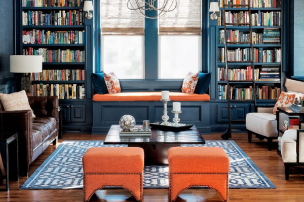
Intensity
Intensity is all about drama and evoking a sense of strength, depth and sophistication. The color palette is full of deep shades of blue, plumb, red and orange intermixed with a balance of black and gold, like what you see in this luxurious home library. We especially love the dark intense look of the blue painted moulding below the reading nook and bookshelves.
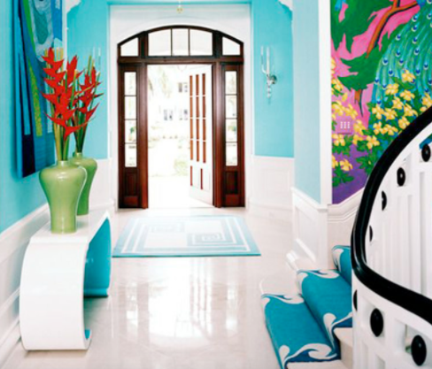
TECH-nique
The TECH-nique color combination is supposed to elicit a futuristic ode to technology and its increasing influence on our lives. This palette is an explosion of loud tones like turquoise, hot pink, fuschia, green, peacock blue and purple alongside Brilliant White and Frosted Almond to help balance the color overload. An example is the neutral wainscoting holding up the bright colored walls of this eye-catching entranceway.
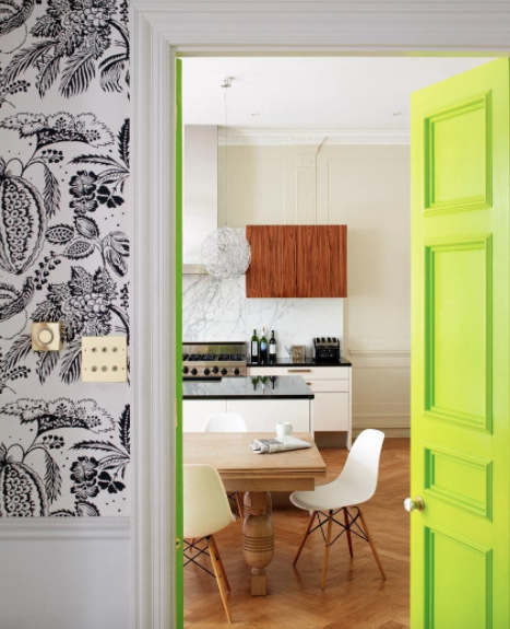
Playful
Bold, defiant and fun, the Playful palette is sure to put a smile on your face. Playful features a fresh combination of bright yellows, lime greens and vibrant blues. Even the paint names are fun: Minion Yellow, Lime Popsicle, Blue Skydiver and Green Flash. This playful kitchen combines a neon green door with white cabinets, warm hardwood floors, decorative moulding and graphic wallpaper. The various colors and patterns really work well together to bring a quirky and lighthearted feel to this space.
Want more color palette and moulding ideas for your home makeover? Get some pinspiration by checking out our Pinterest board.