2020 Color Trends

2020 has hit us with a lot of sudden changes. Our daily routines, how we communicate, our connection to others — All of these have been altered in some way or another. It’s important for us to stay calm as we navigate the world around us, and it starts with creating a stable and relaxing environment through something as simple as color.
2020 Color of the Year
The 2020 Color of the Year, Classic Blue, represents calmness, confidence and connection. As described by PANTONE, “Classic Blue highlights our desire for a dependable and stable foundation on which to build as we cross the threshold into a new era.”
Often seen in nature as the sky at dusk, blue has long been instilled in our minds as a peaceful and relaxing color. In the workplace, research has shown that adding elements of blue increases productivity. Elegant and timeless, Classic Blue is the perfect addition to any home or office.
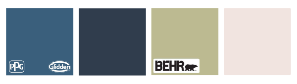
Other companies have also released their own color trends of 2020. Similar to PANTONE’s Classic Blue, PPG Paints’s Color of the Year, Chinese Porcelain, is a blend of cobalt and inky blue that represents serenity. Sherwin-Williams’s Color of the Year, Naval, is another dark blue shade that evokes confidence. Shifting away from the blues, BEHR’s Color of the Year, Back to Nature, is a subtle green shade that soothes the mind. Contrastly, Benjamin Moore’s Color of the Year, First Light, is a refreshing rosy hue that brightly welcomes in a new decade.
What do you think of this year’s color trends? Tag us on Facebook or let us know down below!
We would also love to see how you have used or plan to use the color trends to beautify your home. Tag us in your pictures on Instagram or Pinterest!