Saturated Colors
When it comes to interior design, color is one of the most transformative tools available. It sets the mood, defines the space, and gives a home its unique voice. While soft neutrals and minimalist tones have long dominated design trends, there’s a vibrant shift happening—saturated colors are making a powerful comeback. These rich, full-bodied hues—think deep blues, fiery reds, emerald greens, and opulent purples—add drama, depth, and personality like nothing else. More than just a trend, saturated colors are a celebration of individuality, encouraging homeowners to move beyond the safety of beige and express themselves through bold, intentional design choices.
Whether you’re looking to energize a space or create a cozy, cocoon-like retreat, saturated colors can help you achieve a powerful visual impact. But with great color comes great responsibility—learning how to use these tones effectively can make the difference between a space that dazzles and one that overwhelms.
Choosing the Right Saturated Colors for Your Space
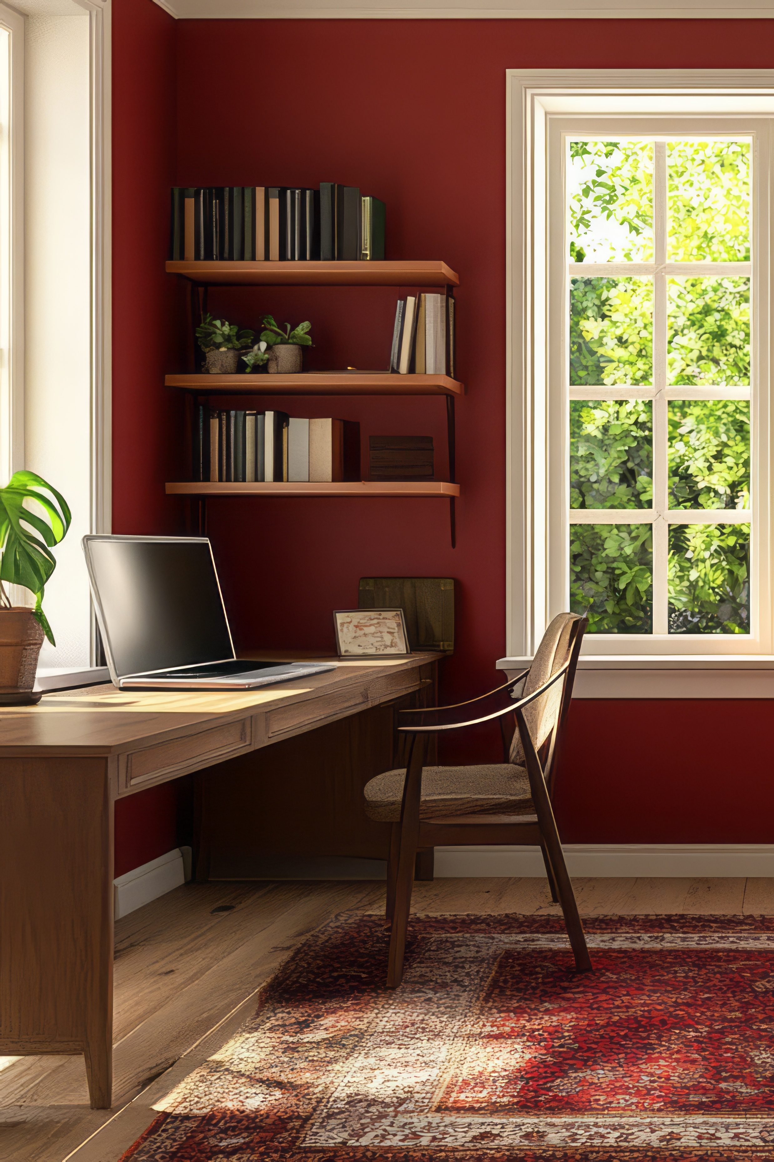
The key to successfully using saturated colors lies in selecting hues that not only reflect your personality but also suit the function and mood of the space. Think about how you want each room to feel. Rich purples and emerald greens can establish a calming, grounded atmosphere—perfect for bedrooms, offices, or any space intended for rest and focus. Meanwhile, vibrant reds, oranges, and golden yellows inject warmth, passion, and energy into living areas, kitchens, or entertainment spaces. Color has the unique ability to shift a room’s emotional tone, so choosing the right hue starts with knowing the feeling you want to evoke.
Lighting is another essential factor. Natural daylight enhances the richness of saturated colors, making them feel more vibrant and dimensional. In well-lit rooms, you can confidently lean into moody jewel tones or bold primary shades. However, in dimmer areas with artificial lighting, the same colors may appear darker or heavier. In these spaces, consider slightly lighter versions of saturated tones—like a soft plum instead of deep eggplant, or cranberry instead of maroon—to retain a sense of balance and avoid creating a space that feels too closed in.
Once you’ve narrowed in on your palette, consider the scale of color you’re comfortable with. If you’re new to bold color, start small: an accent wall, a colorful piece of furniture, or vivid artwork can introduce saturation without overwhelming the room. As your confidence grows, you may find yourself drawn to bolder choices—fully painted walls, richly patterned wallpapers, or entire color-wrapped rooms that envelop you in mood and personality. No matter your level of boldness, the secret is intentionality—choose colors that speak to you, not just what’s trendy, and your space will naturally feel authentic and inspired.
Balancing Bold Colors with Neutrals and Textures
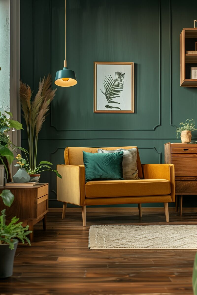
One of the biggest misconceptions about saturated colors is that they must dominate a room. In reality, the most successful designs know when to dial up the color—and when to tone it down. Neutrals are your best friend when working with bold tones. Pairing saturated hues with crisp white, soft beige, warm gray, or even matte black can help anchor the palette and provide the contrast necessary for a balanced, harmonious look.
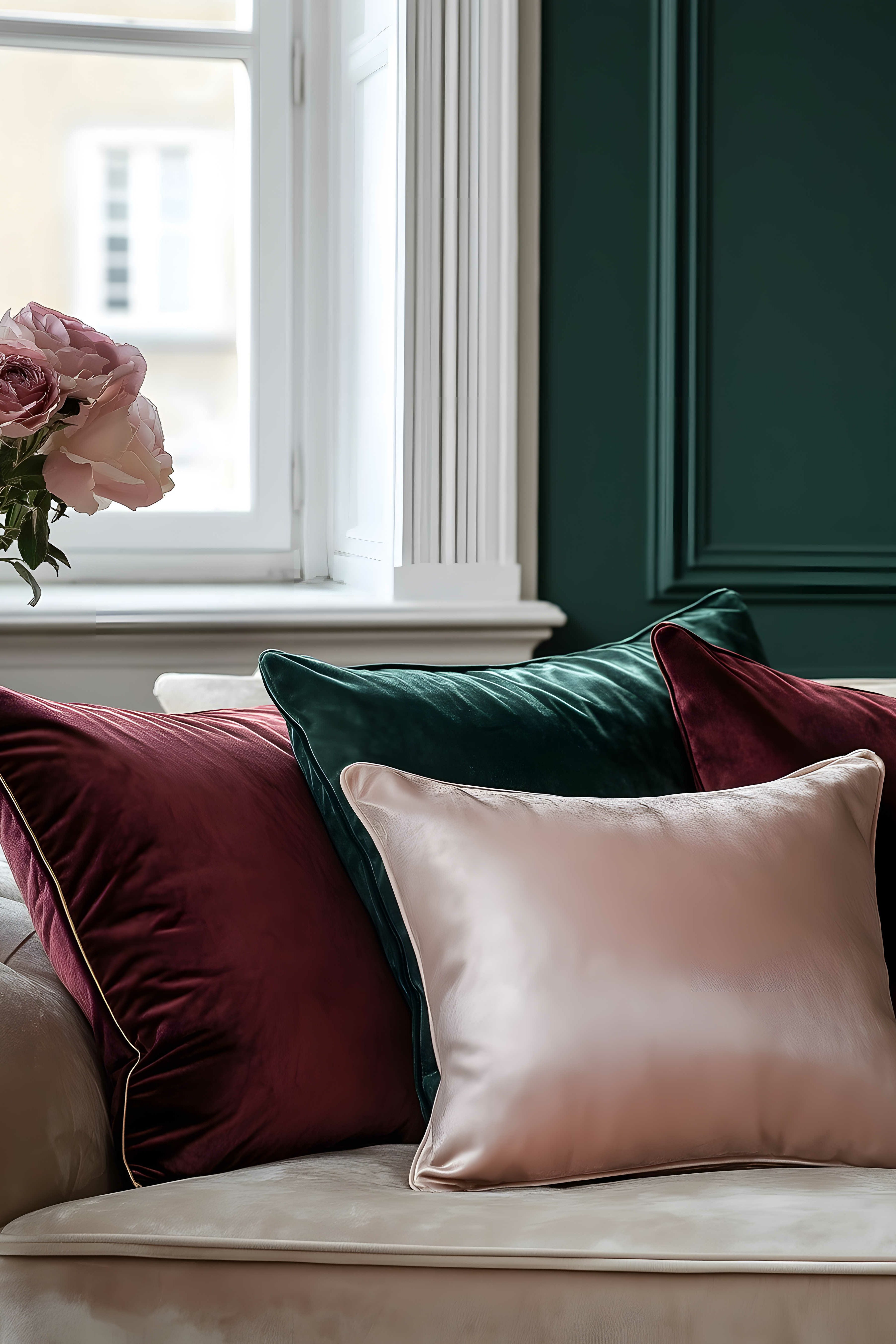
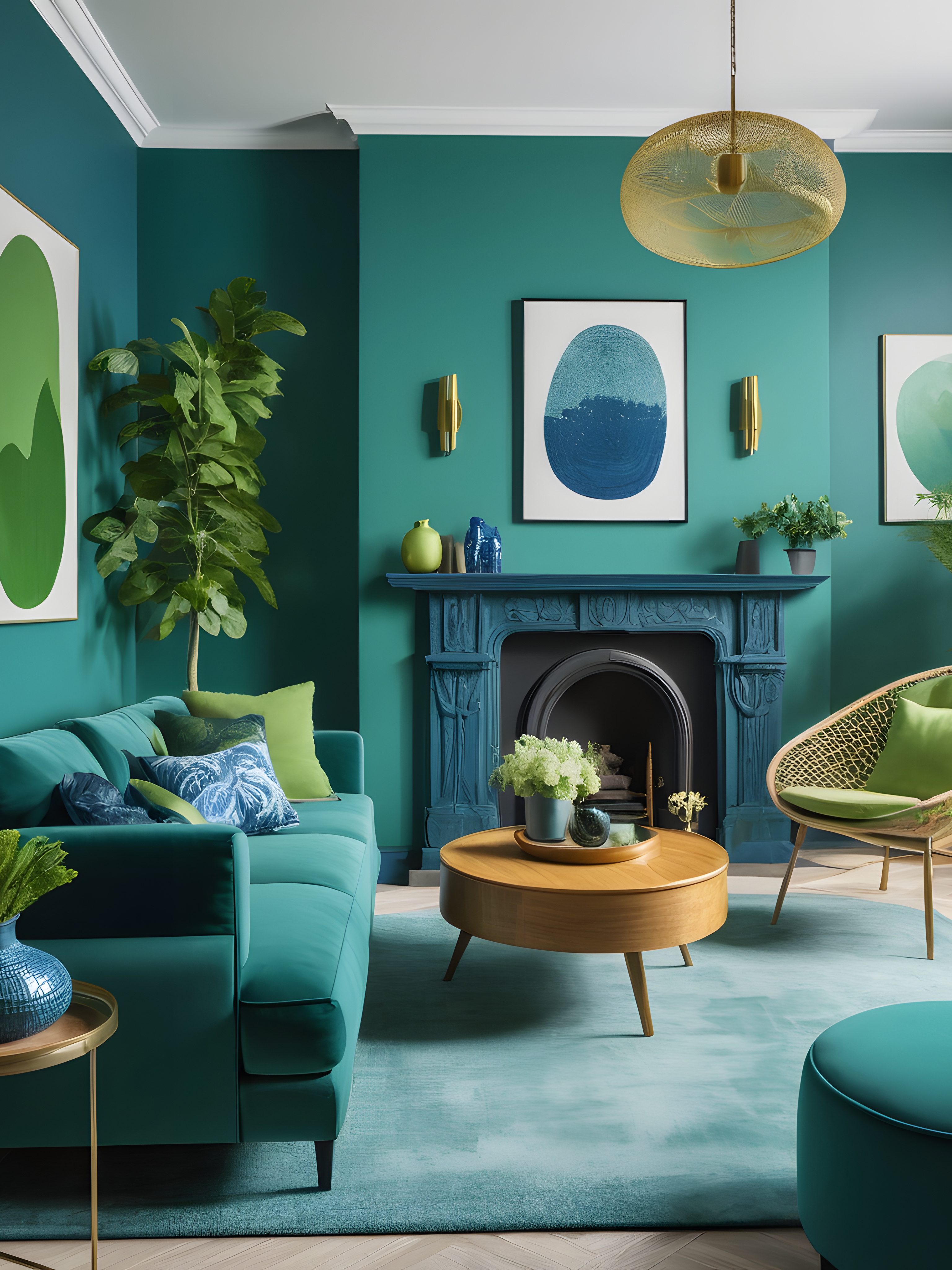
Equally important is texture, which prevents bold colors from feeling flat or overpowering. Imagine the richness of a sapphire blue velvet chair next to a rough-hewn oak table, or a deep plum wall softened by linen curtains and brass lighting. Textures add dimension and help saturated colors feel layered rather than loud. Mix materials like matte paint, glossy tiles, woven rugs, and metallic accents to keep your space dynamic and thoughtfully curated.
The goal isn’t just to use color, but to create a visual rhythm that feels intentional. By blending bold colors with thoughtful textures and complementary tones, you give each element space to shine without competing for attention.
Incorporating Saturated Colors Through Furniture and Decor
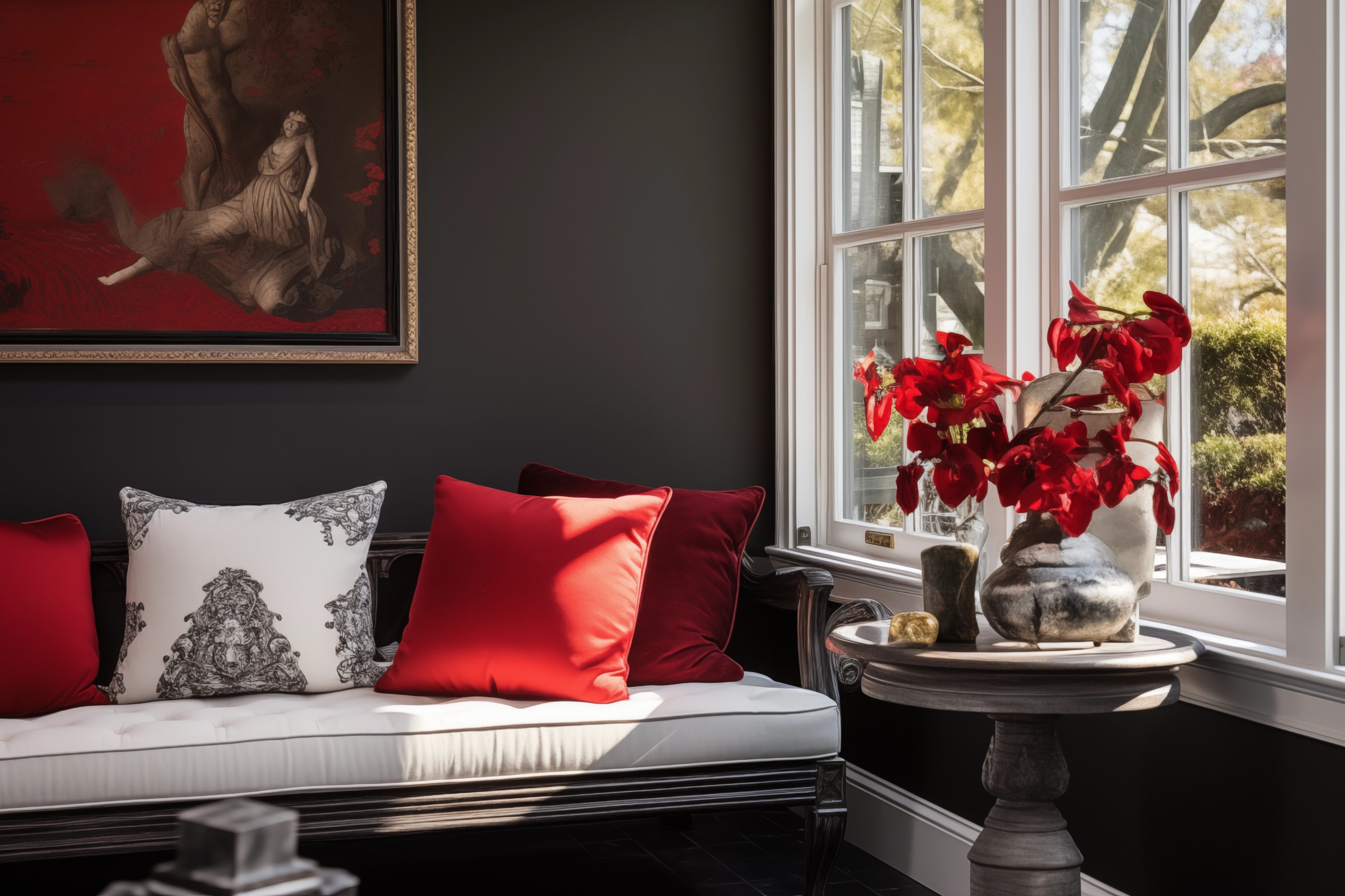
If painting your walls in intense hues feels like too bold of a leap, furniture and décor offer an approachable entry point into the world of saturation. A ruby red armchair, a teal velvet bench, or a striking amethyst-toned rug can act as dramatic centerpieces, instantly breathing new life into an otherwise neutral room. These pieces aren’t just functional—they’re expressive design statements that set the tone and anchor the space.
For a more subtle introduction, smaller accessories like jewel-toned throw pillows, bold-patterned curtains, or richly saturated artwork provide a flexible way to layer in color. This approach is ideal for those who want to test the waters without fully committing. A smart design trick is to use complementary colors—pairing shades that sit opposite each other on the color wheel, such as deep blue with burnt orange or emerald green with blush pinks. These combinations add visual interest and a touch of contrast that feels intentional and lively, without overpowering the space.
You can also use color strategically to draw the eye or highlight architectural features. Placing a vivid piece of furniture beneath a large window, tucking a boldly colored cabinet into an all-white kitchen, or adding a vibrant bench to a hallway can create focal points that energize the space. These colorful accents serve as visual punctuation, guiding the eye and breaking up monotony. The beauty of using saturated hues in furnishings and décor is their versatility—they can be swapped, rearranged, or reimagined more easily than permanent design choices like paint or tile. It’s a low-risk, high-reward way to bring personality and richness into your home.

Trendy and Timeless Color Combinations
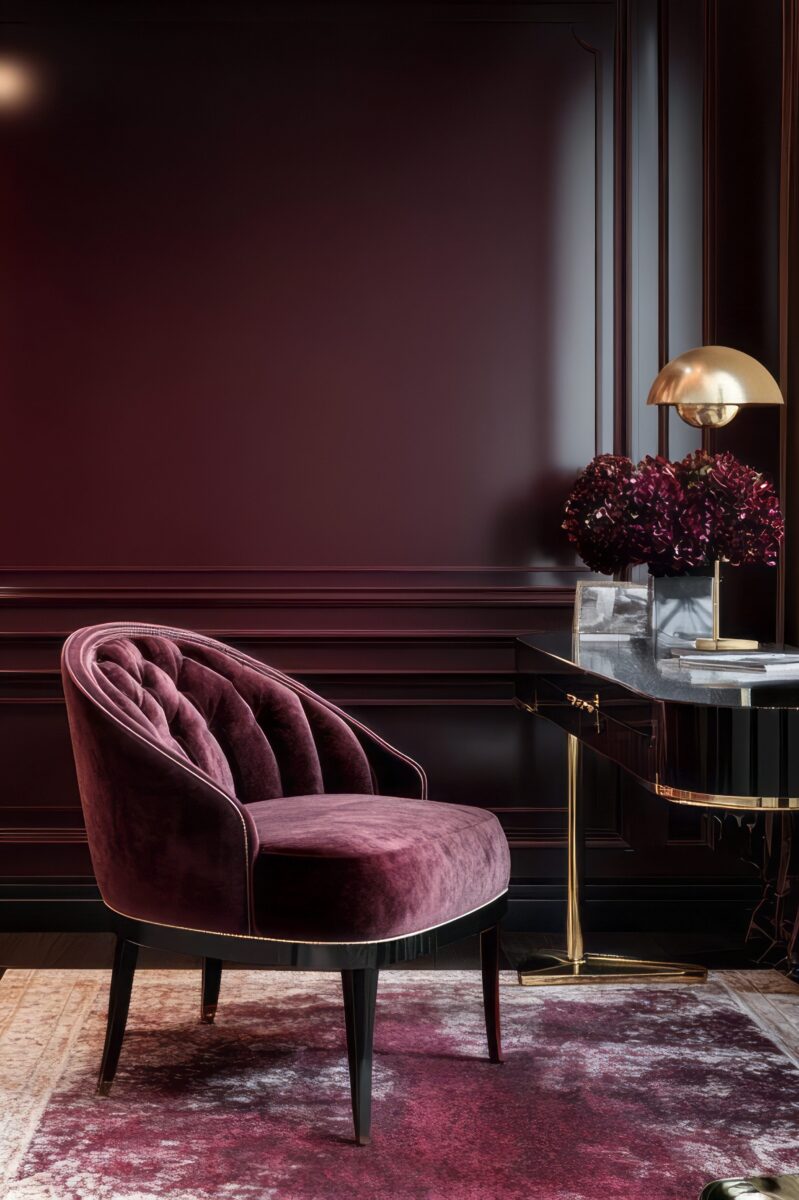
Using saturated color thoughtfully doesn’t always mean going loud or eclectic—it can also mean choosing one color family and exploring its depth, tone, and texture throughout your home. This approach creates a cohesive, signature look that feels both intentional and elevated. By committing to a single hue—whether it’s a jewel-toned blue, a soft mossy green, or a rich burgundy—you allow your design to evolve room by room while still feeling unified.
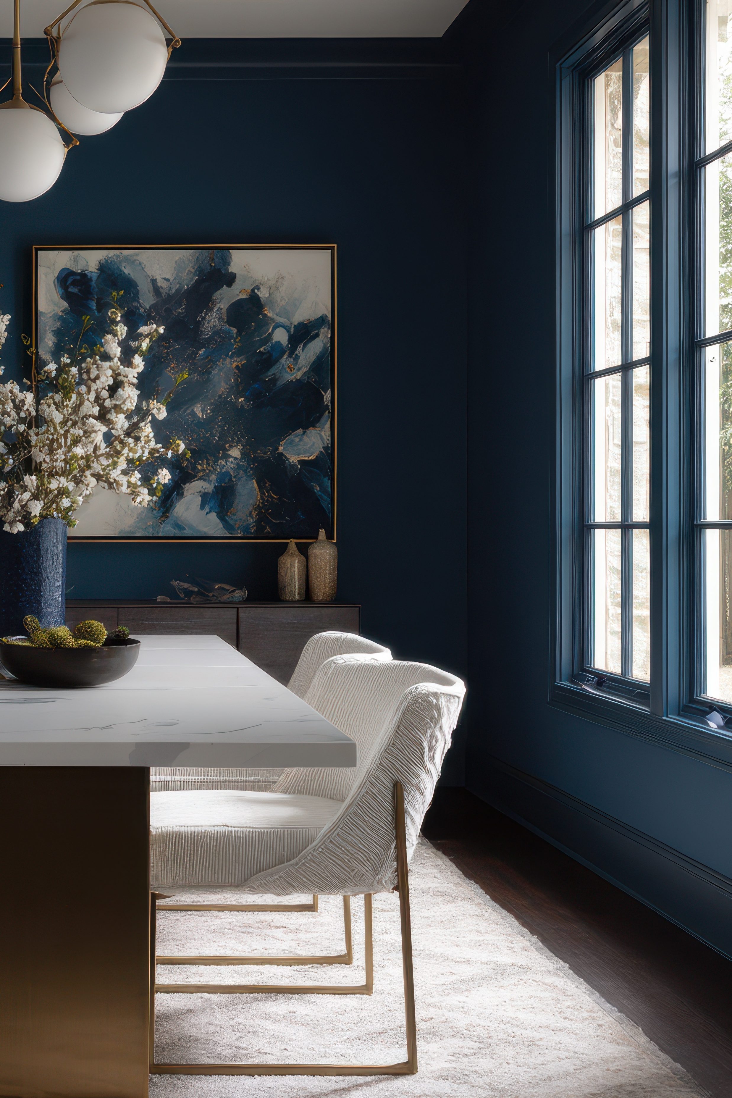
One of the most effective ways to use this strategy is by working with variations of the same color across a space. In a living room, for example, you might use a deep peacock blue on the walls, a slightly lighter slate blue for upholstery, and accents like navy ceramics or steel-toned textiles. Cool-toned blues and greens in varying saturations can create a calm, restful mood—perfect for bedrooms, offices, or reading nooks. They visually tie the room together without overwhelming it, making the space feel grounded yet expansive.
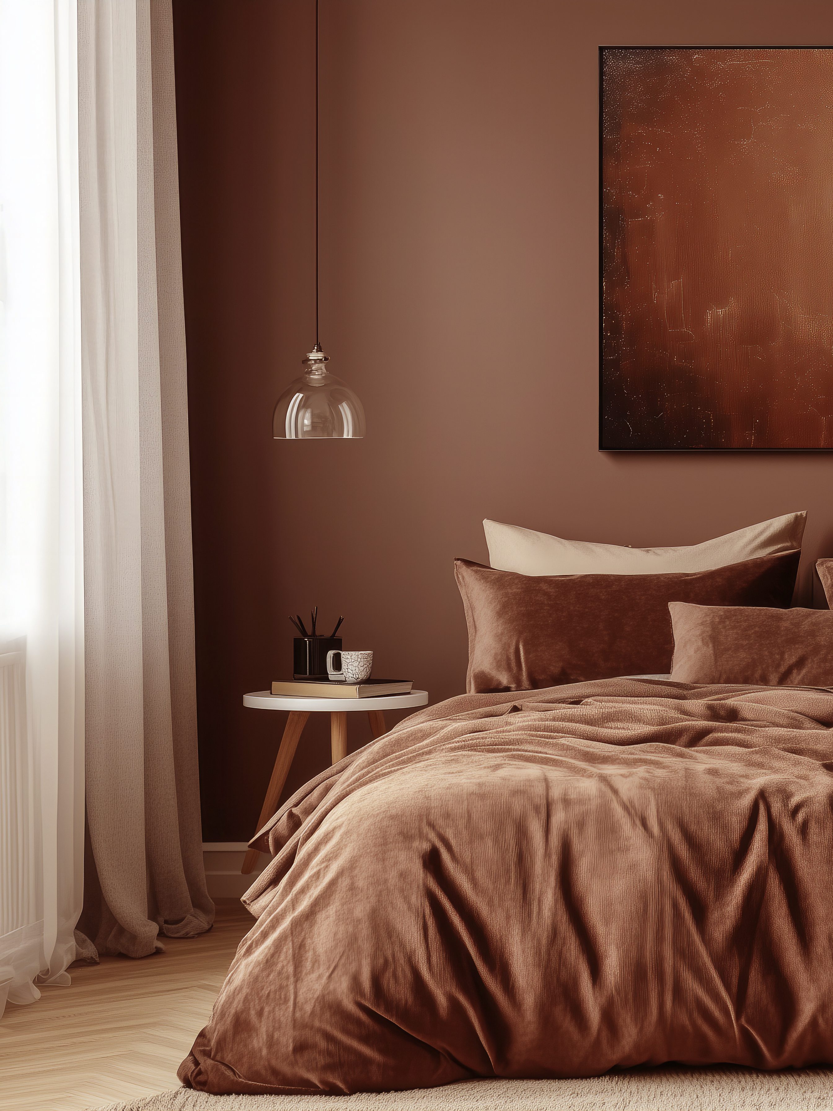
On the other hand, if you want your space to feel warm, cozy, and intimate, you might lean into richer saturated tones like rust, plum, forest green, or chocolate brown. These deep, earthy colors wrap the room in a sense of comfort and security, especially when paired with soft lighting and textured materials like velvet, leather, or nubby knits. From spiced terracotta to cocoa-colored upholstery, layering tones within the same warm palette makes the space feel visually rich but emotionally soothing—almost like a curated cocoon.
Using one saturated color as your foundation—and then playing with cool vs. warm tones, light vs. dark, matte vs. glossy—lets you build a look that’s deeply personal but incredibly balanced. It’s a subtle, sophisticated way to make a bold impact, and it encourages thoughtful design choices that grow with your style over time.
Color has the power to do more than simply beautify a space—it tells a story, sets a tone, and invites emotion. Saturated hues, in particular, bring depth and richness that go beyond aesthetics. They reflect confidence, creativity, and a willingness to step outside the expected to create something truly personal. Whether you’re layering shades within a single color family or mixing bold accents into a more neutral palette, the key is to design with meaning. Every choice—every wall color, piece of furniture, or textured textile—can contribute to a home that feels uniquely yours. Saturated color gives you the freedom to shape the atmosphere, to celebrate your individuality, and to transform your space into a place that resonates with your everyday life. In the end, embracing saturated color is about more than design—it’s about living boldly, comfortably, and authentically. And that’s always in style.
Check out our Pinterest Board for more inspirational designs and make sure to follow us on all of our social media platforms @WeAreWoodgrain